Accessibility in PDF – without the slog of just working in Acrobat. It’s not 2015, you know…!
Paul, the owner of Beetroot – whose work is featured here – had not created an accessible PDF in ten years and was about to dive in doing all the work in Acrobat; not realising that it’s much quicker and easier to do it all in InDesign. I think he was quite shocked when I told him…
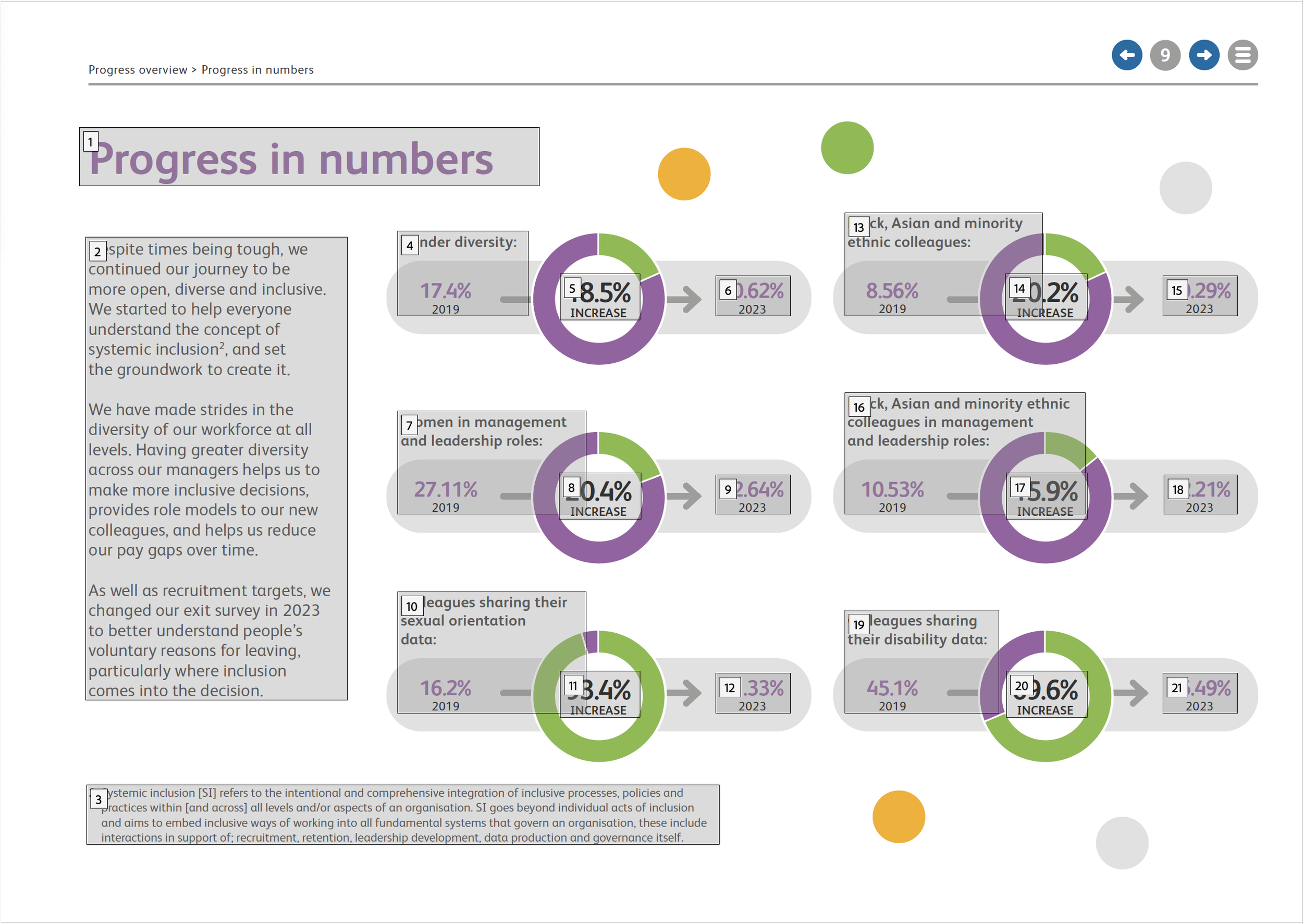
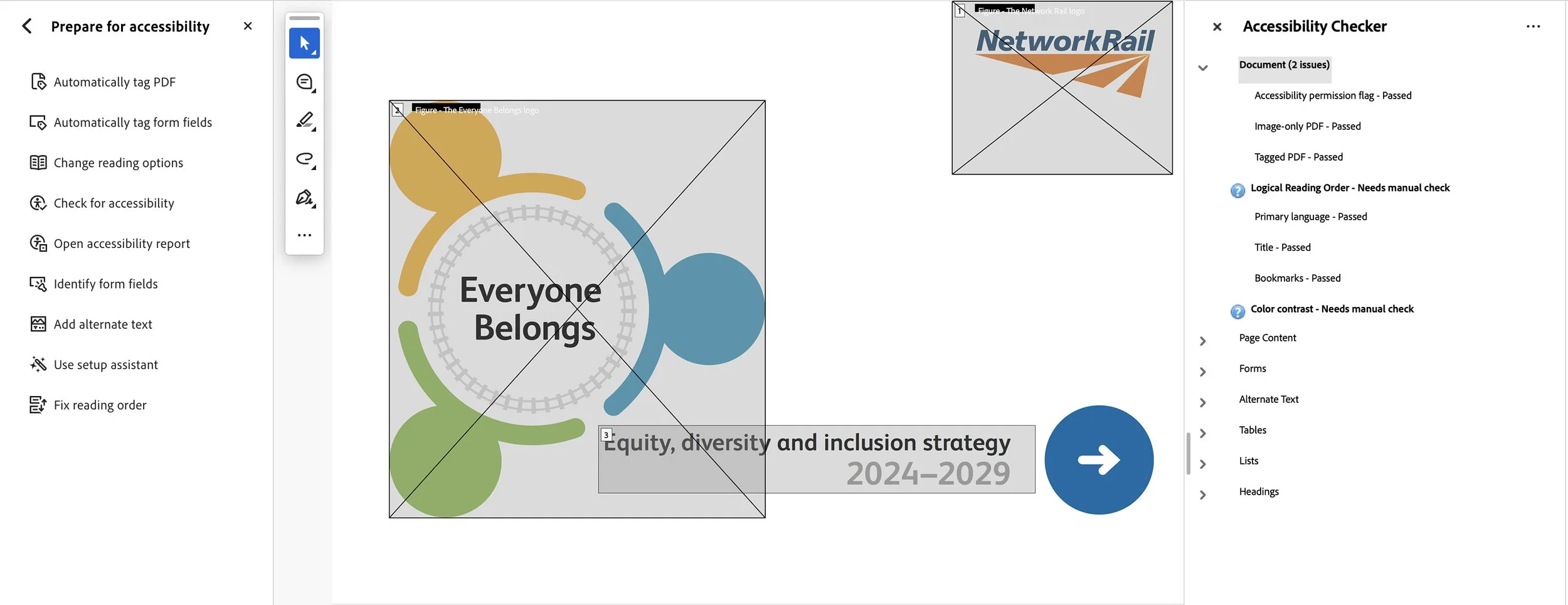
When creating accessible documents in Acrobat, you cannot get better than flags for ‘Logical Reading Order’ and ‘Color contrast’. They are the only two manual checks for accessibility. That means everything else in the document, such as table headers, images, and forms all pass the checks, enabling the document to be read by blind and partially sighted people. I’ve shown typical pages here featuring the correct running order (all of which is created in InDesign using the Articles and Layers palettes – and not Acrobat!).
The colour contrast check is to WCAG standards, which go beyond what can be done in InDesign.
I teach design agency clients how to create accessible documents over Zoom. The investment allows me to tailor the workshop to the client’s individual needs. For more information, see my Services page.